Showing posts with label review. Show all posts

Wednesday, 16 July 2014

EE Kestrel Mini-Review

As usual, this loan device came courtesy of Steve and Ted from Phones Show Chat, and is a curious one, something a little different to the flagship devices which get most of the attention of the technology press. I hesitated to title this as a mini-review, it's certainly not a full review, the reasons will become apparent. In the end it's more of a comparison to its nearest competitor and my current day-to-day phone, the Moto G.


The EE Kestrel has a 1.2Ghz quad-core SnapDragon 400 CPU, 1GB RAM, 4G connectivity, a micro SD card slot, 4.5” qHD screen, and a 5MP camera. The obvious comparison is against the Moto G, which now has a 4G model which also has a micro SD card slot. The Kestrel and Moto G share matching CPU, RAM, connectivity and micro SD specs. Their cameras are on par with each other, both pretty poor. Their speakers are similar, both distort at around 50-60% volume. They both have a notification light! Whilst being very similar, here is how they are different...

Kestrel Positives
  • Price: At £99 the Kestrel wins by between £20-£60 depending on where you buy your Moto G, and if you buy the 3G or 4G model.
  • First impressions: The Kestrel feels snappy on first use, it doesn't feel like it weighs much either when you first pick it up.
  • Capacitive buttons: Gives more screen space versus on-screen buttons.
  • Connectivity: SIM unlocked it works with Three 4G perfectly, which is great given Three is most mobile geeks’ network of choice!
  • Some genuinely very interesting OS additions on top of a base Android build, including:
    • “Networked apps" - you can control access to wifi and mobile data per app.
    • “Startup manager" - control which apps can or can't launch on device boot.
    • “Notification manager" - control which apps can send push messages to the notification panel.
    • "Do not disturb" - on a schedule, per contact restriction of ringing/vibrating.
    • “Power saving" - including ability to select protected apps which are kept running no matter what, an analyser to let you know any power-intensive background apps, and another analyser telling you settings that may be adversely affecting battery life (GPS, screen brightness, etc).
    • “App operations" - show how often each app calls APIs such as location services, personal data, messaging, and device hardware.
    • Audio profiles (a la S60/S40 in the old Nokia days) and a nice easy way to change between them form the notification shade.
    • Split screen for settings - with the "all" pane with the usual Android settings menu, and the "general" pane which has just commonly-used settings, not cluttered up by all the other million and one settings in the "all" pane.
  • Two built-in launchers, although they’re called "home screen styles"...
    • One for normal not tech-savvy folk, which has no app drawer, all icons are on the home screens (a la iOS).
    • One for even less tech-savvy folk, with big easy tiles (a la Windows Phone) for apps and commonly used functions. This would be truly great for those with no interest in learning to use a smartphone, but who want a little more than a feature phone can offer. This home screen style also bumps up the system font, a giveaway that maybe this is aimed at the older person?!
  
Left: Choose your home screen style.
Middle: "Standard" style. No app drawer, just lots of icons like iOS.
Right: "Simple" style. Probably aimed at smartphone novices.

Kestrel Negatives
  • The capacitive buttons aren't very responsive, and their lights turn-off too quickly (the only setting is auto-off and permanently off).
  • The screen is pretty dull, and only qHD (even the Moto G has 720p).
  • The charger (top) and headphone (bottom of left edge) ports are in unorthodox places, a little annoying.
  • Whilst the built-in launchers have their use-cases, anyone reading this blog post would HAVE to install an alternative.
  • In the capacitive buttons row the Kestrel has an old school menu button instead of a recent apps button.
  • The OS is v4.3 and unlikely to be updated in a timely schedule, if at all... (a side effect from all the customisations which have been added?)
  • And the deal breaker... 8GB internal storage. Not so bad given the presence of a micro SD card slot, but this 8GB is partitioned such that apps have less then 1GB. I couldn't even finish installing half of my usual apps. This is exacerbated by the presence of built-in apps like Facebook, Kindle, EE Film and more which you can’t uninstall.
Left: I didn't get to install even half of my usual apps when this happened.
Right: There's loads of space left, just not for apps.

I'd conclude that the storage partitioning is a complete deal breaker for me, so much so that I couldn’t use it as my full-time device to test it properly, and find out how good the battery life was for example.

Huawei/EE have put some very nice touches on top of Android. Some of these are available on other operating systems of course; on Android they may be available via a big bunch of third party apps, plus the need for root in some cases, but they are all here by default on the Kestrel. Whilst the built-in non-removable apps are a pain, the extras on top of a standard Android OS build are mostly commendable, usable, and designed fairly well. I think a lot of normal (non-geek) users would find them useful. To go a step further, the "simple” home screen and launcher could be the basis of the perfect smartphone for an older person or a complete smartphone novice. This is a great Android smartphone for a novice, as Android is still too complex for the average non-geek, and this device with all its customisations makes it much easier for the inexperienced user.


For the money, you would never expect a great camera, high-end CPU or great quality screen. It's great that the Kestrel does 4G at a cheaper price than the Moto G, but the Moto G has a better screen, doesn't suffer the app space partitioning, and is hugely more likely to be kept up-to-date. I would pick the Moto G over the Kestrel any day, though the Kestrel is a very, very interesting device with some very nice touches.

Tuesday, 23 July 2013

BlackBerry Q10 Mini-Review


Thanks to Steve and Tim from Phones Show Chat, I've been lucky enough to get a short loan of a BlackBerry Q10, and I've been testing it out as my almost day-to-day work phone*. All email and Internet access plus outbound calls have been on the Q10, leaving only inbound calls on my previous handset. I was concerned that in going after the consumer market, BlackBerry's version 10 operating system would lose some of the efficiencies of its predecessors as a raw efficient phone call and email machine, instead going after flashy graphics and fancy gesture controls. Well, they have indeed gone after those features, but the physical qwerty keyboard is happily alive and well! This is only a mini-review due to the short time period I had with the handset, and that I was unable to get enough time to test out some major features with a busy workload!

*The almost is because there was simply too much hassle in 1) cutting up my current mini SIM into a micro SIM, plus 2) getting the IT department to remove the BES service on my account, then have it put back on a week or two later!


The Q10 is BlackBerry's latest incarnation of their most traditional form factor; the wide candybar with a physical qwerty keyboard. It's where they made their name many years ago, and is still what most people think of when they hear the word BlackBerry. It's also a favourite form factor of mine for work and getting things done, having already tried touch-based keyboards for the that purpose. When typing acronyms, technical terms, names and lots of punctuation into emails whilst on the move, which my job regularly requires, I still find there is nothing better and more efficient than a physical keyboard. Unfortunately for me, there can't be much other demand in the market for this, as this form factor is now an endangered species.


BlackBerry OS 10

The Q10 launched with BlackBerry OS 10, which is a big departure from the recent BlackBerry OS 5, BlackBerry OS 6 and BlackBerry OS 7 versions seen on the last few years' worth of Bold, Curve and Torch devices. Out go a lot of the old style menu driven functions, and in come swipe gestures. Out goes the entire concept of a traditional home screen used by iOS, Android and Windows Phone. Out goes the nasty low resolution displays and slow CPUs and in comes a lovely screen, lots of RAM, and with it some very nice transition animations. Fortunately this all runs very smoothly, which is probably no surprise given that BlackBerry OS 10 is built on QNX, a real-time operating system built to be dependable and lag-free in multi-tasking environments. Seriously  the animations around the OS are buttery smooth, to borrow a phrase from Google! At the time of writing the Q10 was running version 10.1, with version 10.2 allegedly being around the corner based on leaks into the wild earlier this month.

The new gesture controls take a while to get used to, as does the lack of a genuine "home" screen. The "main" screen is arguably the multitasking view, which gives a vertically scrollable 4x4 list view of running apps, which works really well. Swiping to the screen on the right gives you a horizontally scrollable app drawer, where apps can be re-ordered and put into folders like iOS and many Android-based devices. Swiping to the left from the multitasking view takes you to BlackBerry hub, a unified messaging area for all your email accounts, SMS, BBM, notifications, and calls. Swiping down from the top of the screen in any of these views brings up quick settings for WiFi, Bluetooth, Alarm and a link to the main settings area for the whole device. Within some individual apps this top down swipe gesture gives you the app's menu area, and commonly the app's settings and shortcuts. Swiping from the bottom of the screen upwards at any time takes you back to the multitasking view, which as previously mentioned makes this view (arguably) the home or default screen if you were forced to pick one. Check the bold sections there, that's a lot of gestures to remember! As a full-time geek I found I got my head around this eventually, but I'm not so sure the average user would find this easy at all, especially compared to simpler user experiences and paradigms found in iOS and Android.


Multitasking App Drawer

It should be noted that BlackBerry no longer requires BES or BIS connectivity with OS 10, where OS 7 and previous did. For the average user this is great, as BlackBerry bolt-ons for BIS were only ever confusing, and forced traffic through BlackBerry's own servers which weren't known for their stability, particularly during 2012. For business use, a server-side upgrade to BES 10 is required for the handset to use BES to sync email and PIM data. With my employers not forking out for this paid-for BES 10 licence and upgrade, I opted instead to use ActiveSync. In practice this worked just fine, although during my test period I found it to be 10-20 seconds slower updating email and calendar entries. The standard Microsoft Exchange-based remote wipe functionality wiped the entire device, as opposed to removing the ActiveSync account and its related data.


Apps

My primary use case during this brief period was for work purposes, which only really needs call, SMS and email functionality, and these all pass with flying colours. I use Evernote a lot, and was excited to find it was integrated into the OS. Until I found it was very basic, not even bringing in tags for example. There is no standalone Evernote app, as there isn't for many other marquee services and apps found on iOS and Android, and even Windows Phone in a lot of cases (probably because Microsoft are paying for them). This was one of the areas I didn't have time to fully explore though, as I was using the Q10 only for work purposes, but anecdotally there do seem to be many big-name apps missing from the BlackBerry World app store, and quality games also seemed hard to find. If I were to have the handset for personal use, I would also have tested Google services integration, and was unsurprised when I found very little in the way of first-party Google apps in BlackBerry World, instead finding third-party paid apps for access to Drive and Maps for example. Note that anyone using Google 2-step authentication will have to use an application-specific password to add your Google account for email, calendar and contact sync.

One very interesting feature I ran out of time to test was being able to run Android apps within BlackBerry OS 10. At present this is limited to Gingerbread (v2.3) compatible apps only, but version 10.2 is rumoured to bring support for Jelly Bean (v4.1) apps.

Hardware

This is the best hardware qwerty keyboard device I've used. Unfortunately that's not a great accolade, as all the other efforts in this area, particularly the Android-based ones, were so incredibly poor. We haven't seen an Android phone with physical qwerty keyboard in the UK since the Motorola Pro+ in December 2011, which is 18 months ago, and that too was poor, under-powered and underwhelming in almost every way! There is no such thing as an iPhone with a physical keyboard, and next to none for Windows Phone. The last big stand on physical keyboards outside of BlackBerry was by Palm (subsequently bought out by HP) with the Pre range of handsets, and that didn't end well! So it seems this is a dying breed, which is a real shame for those who love the form factor.


The keyboard buttons have slightly softer click than previous BlackBerry models, but still retain the per-button curved raised edge, making each button easy and quick to locate under your thumbs. I found I was equally fast on this keyboard as I have been on all the previous generation of BlackBerry handsets. The overall build quality is great, very sturdy, and has a great feel in the hand. I didn't have much chance to properly try out the camera or speakers in any meaningful way, but quick tests showed them to be no cause for concern.

Conclusion

Again, I must stress this is mini-review only, and I lacked enough time to properly test things like the camera, using Android apps, and many other consumer-facing apps, features and integrations. However, as a business tool and a natural successor to the Bold and Curve ranges, I was pleased to see that the new BlackBerry OS 10 direction had not detracted too much from the origins of being a very efficient business tool, and whilst it is a little larger than previous models to accommodate a bigger screen, I could definitely use it day-to-day at work. It's great to see a manufacturer put some decent specs behind a handset with physical qwerty keyboard, but I'd still prefer it with Android or even iOS if I were to have the handset for personal use as opposed to work use.


Tuesday, 30 October 2012

Nokia N9 Review

With thanks once again to Steve and Tim from Phones Show Chat, I've been fortunate enough to spend a couple of weeks in the company of the Nokia N9. This device is on loan from the owner as opposed to a PR company for example, and as such had to be treated with a little more care than the average phone I buy myself or a typical review unit. The first challenge came in the size of the SIM card, and having not used a device requiring a micro SIM before, a trip to my local Three store was in order to pick one up.


To set the scene a little history is useful. MeeGo, an operating system collaboration between Nokia and Intel, was announced at Mobile World Congress in February 2010. It was to be a mashup of Nokia's Maemo operating system and Intel's Moblin operating system. February 2011 and with Stephen Elop at the helm, Nokia famously ditched both MeeGo and Symbian from their long-term strategy, and instead choose to partner with Microsoft and Windows Phone became their platform of choice going forward. In a leaked memo to Nokia employees, Elop said: "We thought MeeGo would be a platform for winning high-end smartphones. However, at this rate, by the end of 2011, we might have only one MeeGo product in the market."

Despite MeeGo being dropped from the company's new smartphone strategy, on 21st June 2011 Nokia announced the N9, 16 months after the Nokia/Intel collaborative operating system was announced. Bringing Nokia and Intel's resources together to work on MeeGo was seemingly a complex operation, the fruits of which were taking too long for Elop to consider it as a viable contender going forward. It was therefore questioned why Nokia released the N9 at all, as the present incarnation of the operating system had no future, and rumour of the same physical chassis design being used for Nokia's Windows Phones turned out to be correct. The N9 started shipping in September 2011 to a select group of countries which did not include USA, UK or India, and Nokia's N9 availability page confirms that the device never officially made it to these countries.

Hardware

The N9 press release referred to "hardware and software (that) were jointly designed to ensure that they fit together seamlessly", and they certainly did a good job here. A year after the device's launch and we know the same deign was successfully re-used in Nokia's Lumia line of Windows Phones and won a good share of design prizes. The phone's chassis is milled out from a single piece of polycarbonate, with curved glass across the front which flows nicely in to the curves of the handset. It feels very nice and surprisingly small in the hand, as the 3.9 inch screen is surrounded on the sides by very little in the way of bezel. There are no front facing buttons, and simply a power/lock button and volume rocker on the right hand side. The bottom edge is perfectly flat, such that the device stands upright with no support, and here you'll also find the speaker.


The top edge is also perfectly flat, meaning the N9 also does great headstands! Here you'll find the 3.5mm headphone socket along with an ingenious flap and slot mechanism, to hide first the micro USB port for charging and data, and second the micro SIM tray.


The glass front protects a front-facing camera in the bottom right and a white notification light in the bottom left corner. The screen is AMOLED and includes Nokia's ClearBlack Display technology, a pair of polarizing filters which combine to gives better viewing angles and greater visibility in sunlight. At the rear you'll find an 8 mega-pixel camera with Carl Zeiss optics and dual LED flash, and the camera glass is very slightly recessed, maybe half a millimetre or so, from the rest of the chassis, presumably to stop it getting scratched when the phone flat on its back.


The N9 weighs in at 135g, the same as a Galaxy Nexus but heavier than the iPhone 5, but feels very solid due to the single piece chassis design. I haven't dropped it (yet) but I'm very confident it would survive most day to day falls from tables, pockets and armchairs!

The usual hardware specs aren't going to mean a huge amount without lots of other MeeGo phones to compare against, but for completeness we have a Cortex A8 clocked at 1GHz, a dedicated GPU, and 1GB of RAM. The battery capacity is 1450 mAh, and I never ran out of juice during a full day, so clearly a lot more power efficient than your average Android device!

Operating System


The Nokia N9 is a MeeGo based device, but the user interface layer is referred to as part of the operating system itself, as the device's "About" screen states, this isn't just MeeGo, it is MeeGo Harmattan. Named after a West African trade wind, Harmattan refers to the swipe-based user interface on top of MeeGo, and is very different to most other mobile interfaces.


Three areas are presented in Harmattan: events, applications and open applications. Each is a whole-screen view which scrolls vertically to show more content. To move between each view a swipe from the left or right edge of the screen to the other is needed, similar to swiping horizontally between homescreens in Android for example. The swiping wraps around, so swiping continually from one side to the other will move you in a loop through the three views. As you'd expect, the events view gives you notifications like meetings, incoming messages, missed calls, and feeds from social networks. Applications view is a very colourful and visually pleasing grid of icons used for launching apps, and all currently running apps can be found in the third view called, you guessed it, open applications. In open applications view, apps are represented by live views of the apps themselves in a 4 by 4 grid view, and pressing and holding brings up the option to close one or all of your running apps.


Left to right: "Events" view, "Applications" view and "Open Applications" view


The swiping doesn't stop there though. From any app you can swipe edge to edge horizontally to take you back to where you came from. Sounds odd? Well, if you came into the app from the applications view, it will take you back there. If you came into the app from the events view, it will take you back there. After half an hour of using the N9 it becomes second nature and very intuitive, and I've since been doing the same swiping motion on my Nexus S somewhat amusingly. A full swipe upwards from the bottom edge does the same and returns you to where you were before you opened the app. 

Whilst in an app you can swipe from the top edge downwards to close the app altogether, which is even more amusing for previous Android users who are used to doing this motion to see the notification drawer, and I did initially close a few apps by mistake in the first hour or two! The final swiping gesture whilst in an app is upwards from the bottom edge, but instead of a full swipe, a small swipe/flick to anywhere around the half way mark dims the app and pops up a drawer of 4 icons for your most commonly used apps, which is very useful to quickly get to the camera for example.


Quick access to 4 of your most commonly used apps with a small swipe upwards

There's more swiping in the lock screen too: a full swipe vertically or horizontally from either direction will unlock the phone (or bring up the passcode screen if you have chosen to enable it), and the half swipe upwards to show the drawer with 4 app icons also works from the lock screen. Again, if you have passcode lock enabled these apps can only be launched once the passcode is entered. After a few seconds the lock screen times out to the standby screen, which by default shows the time and notification icons. I've also got the weather courtesy of the MeeCast app. Interestingly you can wake from standby with the expected press of the power/lock button, but also by double tapping the screen!


Lock screen

By now you're probably getting the message, lots of swiping! Writing all of these gestures, and subsequently reading them, or even explaining them to someone vocally seems long winded, but the reality of using the device day-to-day is that it all becomes second nature very quickly. Returning to other mobile operating systems such as my usual Android and employer-provided Blackberry seem very old and unintuitive in comparison, and flicking and swiping away at the screen to get things done in MeeGo Harmattan is genuinely a joy.

Delving further into the operating system we find there are references to other platforms: tapping the status bar at the top of the screen reveals controls to switch notification sound profiles, between ringing, quiet beeps and silent, along with a volume slider control and shortcuts to WiFi and Bluetooth settings, the like of which we've in some incarnations of Android-based devices. Pressing and holding an icon in applications view gives you the opportunity to move your icons, create folders and uninstall apps, reminiscent of iOS. There is an "accounts" area, where anything from Google, Dropbox, Twitter, Youtube, Facebook to name a few can be configured to feed the single events view (as well as feeding other things like contacts, sharing services, etc), similar to WebOS.


Left to right: Status bar drop-down, Accounts app, moving application icons

There is now certain amount of uncertainty over future development of MeeGo Harmattan though. There have been 4 releases since September 2011, and whilst N9 owners rejoiced when the latest version dropped, PR1.3 in July 2012, it was a bittersweet moment as the Maemo team also departed the same month.

Apps

Despite MeeGo Harmattan currently having no viable future at Nokia, the app situation isn't as bad as one might expect. Of the "core" apps I personally expect/need from a smartphone in 2012 I've only hit two big stumbling blocks so far. For the following there are good quality apps from either the service themselves or 3rd party developed apps:

Twitter, Dropbox, Sports Tracker (GPS tracking/stats for running/cycling), FotoShareN9 (to instantly upload photos to the cloud for safe keeping, Google Latitude, Podcatching, Last.FM Scrobbling, Weather, Barcode Scanner (barcodes and QR codes), Google Reader, Google Drive, LinkedIn, Kindle...

You also get Nokia's excellent maps and turn-by-turn satellite navigation, all free out of the box, with downloadable country/state maps. The two stumbling blocks for me were Evernote, where EverN9 exists but is broken and has been discontinued by the developer so a fix is unlikely, and Sonos. With apps for those two I could call it 100% for me, although everyone's mileage may vary, and you may find another app/service that isn't catered for. The chances may be slim though, as there is a very active and friendly community around the N9. Unsurprisingly there are a lot of people who tried/bought the device and loved it, and wanted to get the best experience possible. So you'll find loads of helpful forums, great contacts on Twitter, and lots of 3rd party developed apps for MeeGo Harmattan and the N9. With some caveats, you can even run Android apps thanks to some insanely clever folk! If you pick one of these up I'd recommend the following sites: Talk Maemo, Everything N9, My MeeGo. Also follow these guys on Twitter: @everythingn9, @MFaroTusino, @andyhagon, @stephenquin58.

Camera

As previously mentioned the N9 has an 8 mega-pixel camera, with Carl Zeiss optics (a wide 28mm lens with f/2.2 aperture) and dual LED flash. The video recording mode goes to 720p at 30fps, which has become a baseline standard to smartphones in 2012. Both performed very well; sample shots below.


Conclusion


Sadly, the N9 is ultimately a frustrating device. And its not even the N9's fault, it's Nokia's. What we have here is a new user interface paradigm which is graceful, intuitive, smart and different to pretty much everything else out there. Outside the operating system and user interface, we have beautiful award winning hardware, a terrific camera and a great screen. The curved glass and rounded edges of the device match perfectly with the swiping gestures in MeeGo Harmattan; it is obvious that it truly was "hardware and software (that) were jointly designed to ensure that they fit together seamlessly", to quote the N9 press release. The frustration is that Nokia jumped the MeeGo Harmattan ship, before the N9 had even been announced to the world. PR1.3 may be the last update to the operating system, and whilst the MeeGo and N9 community is incredibly strong, it is only a matter of time before it starts to diminish. Or is it?


Jolla is a company founded by the ex-MeeGo developers of Nokia, and aims to continue working on MeeGo from the state Nokia left it in when the Maemo team was disbanded. Codenamed Sailfish, Jolla's mobile operating system will have bases in Mer and Qt, and their plan is for the product to be used in smartphones, tablets and many other devices. Whilst this isn't MeeGo Harmattan by name, it is by its roots and by the people working to bring it to life. Fingers crossed we get another viable and long-term mobile platform from these guys.

Sources: Nokia, Taskumuro, Engadget, The Verge, My Nokia Blog

Thursday, 20 September 2012

HTC One V Review

The HTC One V was announced at Mobile World Congress in February 2012, along with its larger siblings the One S and One X. It went on sale in the UK in April, and thanks to Steve and Tim from Phones Show Chat, I've been able to use a review unit as my primary device for the last few weeks. The One V is without a doubt third in the pecking order behind the One S and One X in HTC's first half of 2012 Android line-up, but my penchant for smaller devices has meant the One V was always been the one I was most keen to try out.


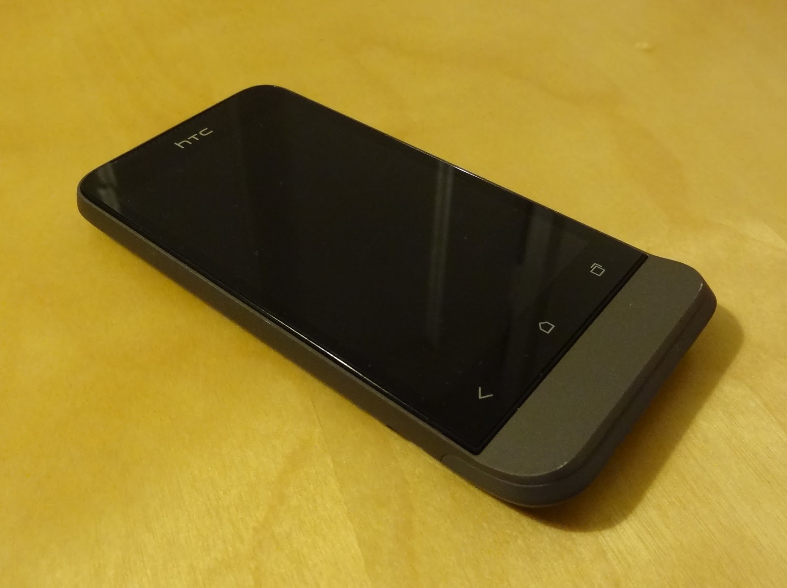
HTC One V

Hardware

The design of the chassis is very reminiscent of the Legend, HTC's 2010 phone with an infamous chin. You can in fact trace the heritage of the chin through the Legend, the HTC Hero and all the way to the T-Mobile G1, the phone that first introduced us to Android back in 2008. Also shared with the Legend is the uni-body aluminium construction, making the device feel incredibly sturdy in the hand and giving a sense of quality merely through it's weight alone. That's not too say it feels heavy though; at 115g it certainly isn't overweight, but in direct comparison to its plastic-constructed counterparts you will notice a difference.


Spot the difference! HTC Legend (left) and HTC One V (right)

Part of my keenness to try out the One V was its size, something which ironically would put a lot of smartphone enthusiasts off. At 120mm x 60mm and with a 3.7 inch screen, the One V is much closer to "phone-sized phone" than current flagship devices from all the Android manufacturers. 4 inch screens appear to be the absolute minimum for anything with top end specs, and most flagship devices (see the Galaxy S III, Razr Maxx, Xperia S, Ascend P1, Optimus L7 and One X) are in fact comfortably closer to 4.5 inches. Bezels are getting smaller, and devices thinner, but there is still something about about a 3.5/3.7 inch device that just fits nicely into the pocket in my opinion!

My personal preference is still for a physical home button, something with which only Samsung seem to agree. Unfortunately for me therefore, the One V has backlit capacitive buttons for "back", "home" and "recents" (the three standard navigation system buttons for Android going forward). They work fine though, and we still have physical buttons on the right side of the chassis to control volume, and a power/wake button on the top. Also on top is a notification light, something rarely included in recent handsets.


At the bottom of the One V, on the reverse, you'll find the one break in the aluminium uni-body; a hatch constructed of plastic which houses access to the full-sized SIM card slot, and micro SD card slot. The aerials are also expected to do their work through this area of the chassis, which doesn't work particularly well in my experience. WiFi performance was on par with other plastic-based devices I tested alongside the One V, but GPS performance seemed weak, taking longer than other Android handsets to gain accurate location from cold-start, and losing lock whilst driving using Google Navigation. Tim from Phones Show Chat had also noted poor cellular performance during his testing. There is clearly a cost/benefit analysis to be done for this type of chassis construction, and whilst not disastrous in my testing, it does seem that the solid feel gained from the aluminium body impacts performance of the wireless components.


Plastic hatch reveals SIM and microSD slots


Screen

At time of writing in September 2012, the HTC One X arguably had the title of best screen amongst all the Android handsets on the market. The One X's Super LCD 2 technology, whilst curiously not used in the One S (AMOLED in case you were wondering) is in fact used here for the One V, and the results are stunning. At 800 x 480 WVGA the One V clearly doesn't have the resolution of the flagship One X, or the pixel density (~250ppi against ~310ppi), but the colours are extremely vibrant and the viewing angles amazing, coupled with that feeling that the display is on the glass as opposed to behind it.


The impressive One V screen


Not so impressive is the storage: 1GB for apps and 100MB for media, and a 2GB SD card in the retail package (though not included in the review unit I had). The 1GB space carved out for apps will serve non-geeks just fine, but the chances are that if you're reading this review, it won't be enough for you long-term. The 100MB for your media is nothing but a token gesture, so all media storage hinges on the SD card, and you'll want to swap that measly 2GB card out for a larger one pretty quickly. At least you can swap the card out though, something or a novelty amongst the increasing majority of devices not shipping with micro SD slots.

To wrap up the hardware, the One V has been very light on its 1500 mAh battery. Android devices are notoriously poor in their efforts to get through a single day on charge, an attribute I can confirm with personal experience of over 10 devices I've personally owned and used day-to-day whilst being truly mobile. Recent exceptions like the Galaxy Note and Razr Maxx have included large capacity batteries, but for the One V to last as long as it does in my normal usage pattern, with only 1500 mAh, is very impressive.

Operating System

The core specs of the One V are very mid-range in the current market. A 1GHz single-core Snapdragon CPU pairs an Adreno GPU along with 512MB RAM. This is probably the bare minimum for an Android 4 device such as the One V, and whilst there isn't any appreciable lag around the operating system, you don't get the same fluidity as the Galaxy S III or Galaxy Nexus for example. No less than four software updates were waiting for me on booting up the One V for first time, core app updates and "system updates". I'm not sure why these couldn't be wrapped up into cumulative updates, as the full reboot each time was a pain! I was hoping one of them would be an upgrade from Android 4.0.3 base to 4.0.4, but this wasn't forthcoming. Android 4.1, codenamed Jelly Bean, has been promised for the One S and One X, but at time of writing there has been no word from HTC about the One V.

Regular Android enthusiasts will know that as an HTC device the One V comes with HTC's interpretation of Android, Sense. We're looking at version 4 of Sense, and one which is cut-down from the "main" version of Sense 4, as seen on the One S and One X. HTC inexplicably created their own version of the recents view (aka multitasking) for Sense 4, but presumably due to the system resources required this has been dropped for the One V, with its weaker CPU and lower RAM count. There are also 5 homescreens instead of 7, and fewer 3D transitions when compared to the One V's bigger siblings.


One V Sense/stock mix and match!
Left to right: Sense lock screen, stock recents screen, Sense app drawer

The rest of Sense 4 is however fully in tact, but if HTC had to cut down Sense 4 on ICS to fit the One V's hardware resource limitations, I'm actually not surprised they haven't committed to getting Jelly Bean out to the One V. Not only would Jelly Bean have slightly higher resource requirements, but there may be even more work on the Sense front, cutting even more bits out here and there to again fit the One V's smaller resource limitations.

Now, whilst Sense 4 is less of an eye sore compared to previous incarnations, I still dislike HTC's customisations and general look and feel. They may only be little things, like the effect when scrolling to the end of a menu list, or the circular tick boxes with frustrating colour choices, but when they are as frequently seen as those GUI components are, they can start to annoy. A lot. See below the mix of GUI elements, tick boxes and themes all present in one phone. Interface consistency is certainly one area where iOS and Windows Phone are streets ahead or Sense-based Android phones (and any skinned android phones in fact), and provide yet another good reason for Android manufacturers to lay off their skins and go with stock.


How many themes?
Left to right: Sense Bluetooth, Sense Privacy, SMS Backup+, GMail, Seesmic

I encountered a few bugs during my time with the One V, the first being the WiFi network notification. I turned this off but it still persisted. Through turning it on and off a few times, and a factory reset, this was still the case so, can only presumably be a bug. The second was the lack of calendar notifications, where events with reminders passed without any notification from either the stock calendar app or Business Calendar, whilst notifying on all my other Android devices. Again, this persisted through clearing the calendar app's data, and a factory reset, so again appears to be a genuine bug. Both of these were after checking for updates and being up-to-date, as far as the phone reported.

Camera

Dedicated camera buttons are seemingly on the way out; very few devices are seen with this useful hardware feature, with a few exceptions and camera-centric phones like the Nokia N8 and 808 Pureview. The One V therefore relies like many on screen presses for taking pictures, and focusing, should you wish to compose your shot off centre for example. There is a 5 mega-pixel unit, incorporating HTC's "Imagesense" technology, with a dedicated imaging chip and backside illumination sensor claiming improved low-light performance. This may be true, but I had very varied results with the One V, from decent indoor shots and good outdoor close-ups, to very poor shots of anything past a couple of metres away, see the sample photos below and see what you think.


Sample shots from the HTC One V

Shutter lag is however very minimal, and there is a continuous shooting mode accessed by holding down on the shutter on-screen button. Also impressive is ability to take photos whilst recording video, admittedly recently released in iOS 6 so no longer unique. Video recording is available up to 720p and is again good enough without blowing anyone away.

Conclusion

Living as I prefer and choose to do with smaller phones, I've become far too used to devices like the One V. Its larger siblings, the One S and One X, have far better specs and take all the glory, and the One V is left to splutter along with a slimmed down software experience to match its under-powered hardware. Sure the screen is great, one thing that did make it down from the big daddy One X, and the chassis design incredibly sturdy whilst providing great feel in the hand, but the camera was inconsistent, the software trimmed, and even then not as smooth as the flagship devices, and you really can tell this is handset is firmly in that terrible clichéd "mid-range" territory.


My closing comments apply to HTC as much as Samsung, Sony and all the other Android manufacturers, in that this size of device (under 4 inch screen) does not have to automatically mean that is has to hit the mid-range price bracket. Size of chassis does not have to be proportional to price of handset, and as most flagship handsets are incredibly thin, I no longer believe that the top-range specs could not fit into a chassis the size of the One V, based on overall volume of chassis comparison. I can only assume I'm in a minority and that all the focus groups and consumer studies show otherwise, and that people want larger devices for the large screens, so for now this trend seems unlikely to change.